A Rootsy Recap: Our Favourite Projects of 2025
Georgie Client Relationship Manager
Published
A very busy year
2025 has been a crazy busy year for the Roots team. We’ve worked on some awesome projects, with amazing clients both new and old. In an uncertain economic climate here in the UK, we feel incredibly lucky to still get to work on interesting, creative projects that excite us.
So, to celebrate another manic year coming to a close, here’s a wrap-up of what this year has looked like for us – and the projects that have kept our team on their toes this year!
Katie’s favourite project
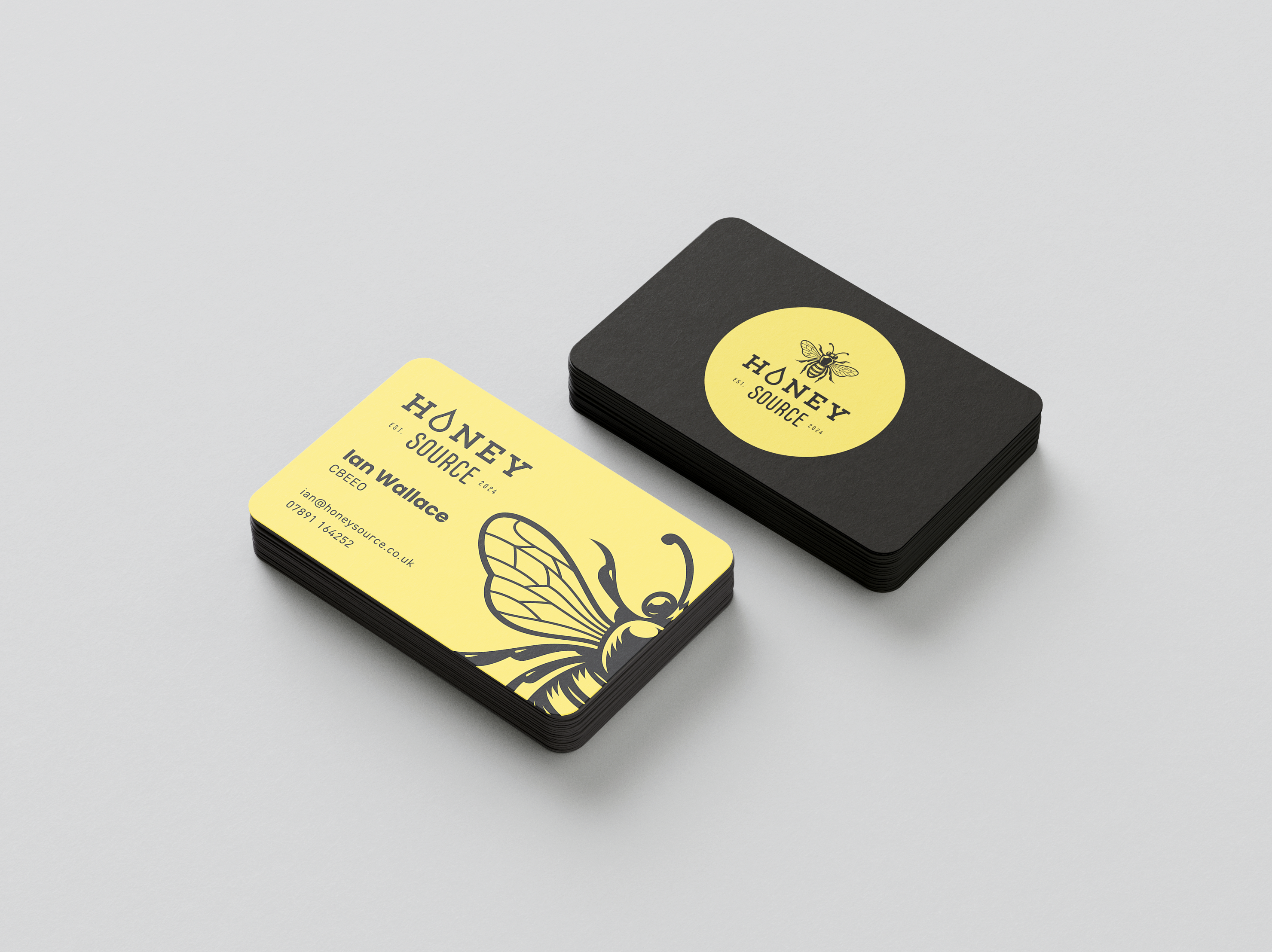
Honey Source brand, website and marketing
This year started strong for us as we officially began making progress on Honey Source – a particularly sweet new venture from Ian Wallace of Quince Honey Farm fame (seriously – we’ve seen their monthly search volume on Google). Roots had worked with Quince a few times and already knew that Ian was exactly the kind of client we love to work with, and Honey Source proved why.
Honey Source is an online emporium for the best of British honey. We began with an exciting brand creation and rollout for the flagship Honey Source brand, including creation of a vibrant website that’s one of our favourites to this very day. We also created a few new brands and packaging designs for new Honey Source products – Westcountry Apiaries and Wild Acres Honey (which also required landing pages) and the premium Wallace Honey.
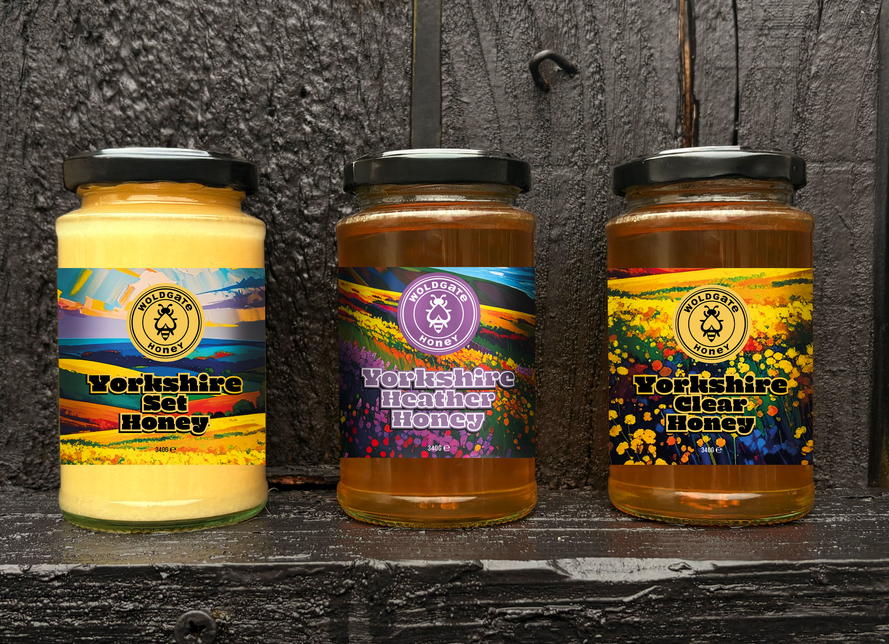
Ian was kind enough to pass our details onto some of the bee farmers in his network which is how we ended up creating new packaging for Woldgate Honey and Field Honey too. You can read more about this one in our dedicated blog.
So where are we now? Everything is up and running and the sales are beginning to come in (we even spotted our Westcountry Apiaries designs on sale at St Nicolas Market in Bristol this month!). The project continues in 2026 with key priorities being social media management and digital advertising.
Elliot’s favourite project
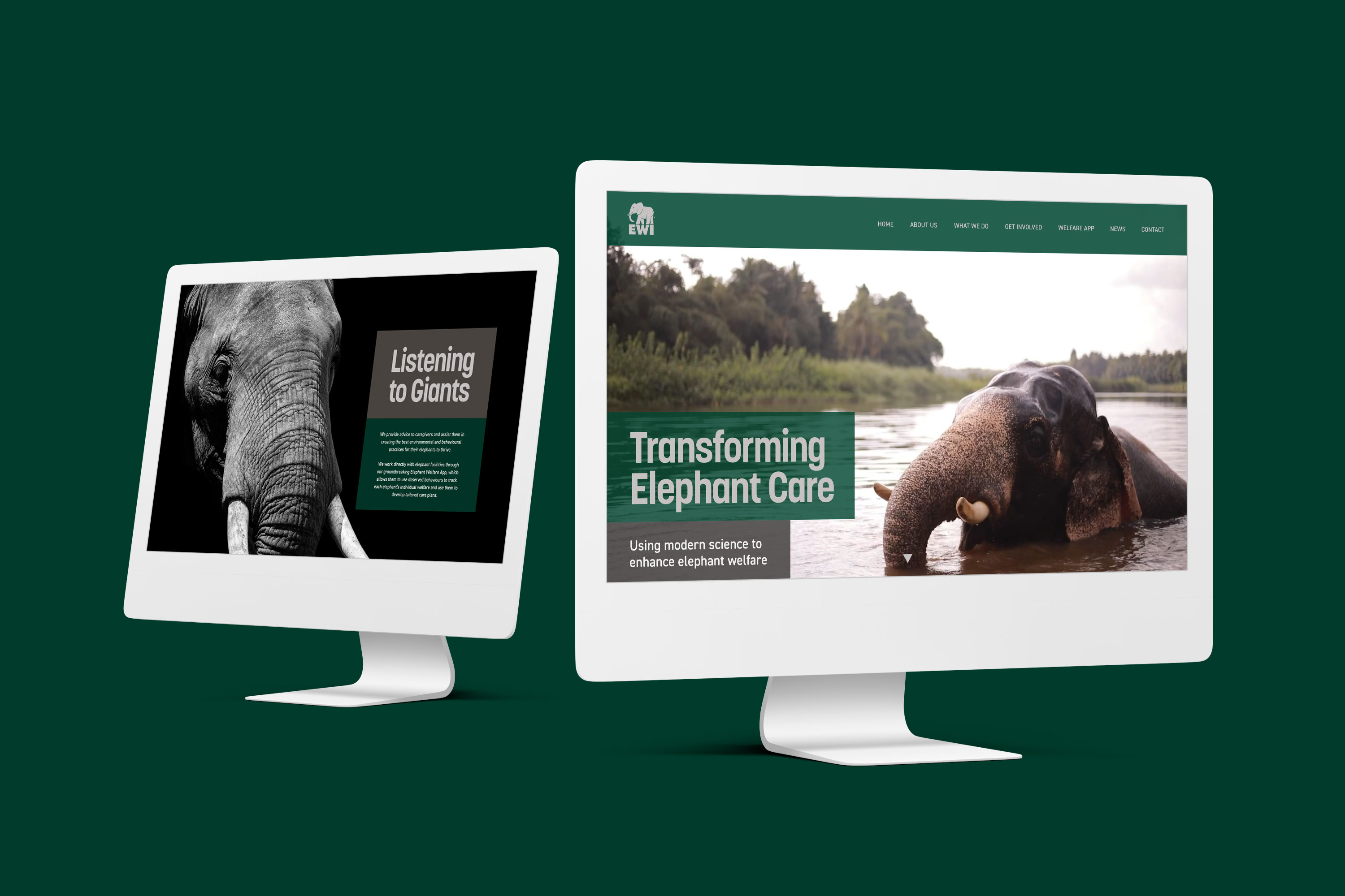
Elephant Welfare International brand and website
We love animals here at Roots (just ask our office dogs, Cicero and Sasha), so getting to develop a brand and website for Elephant Welfare International was just our cup of tea. Elliot project managed this one, and loved collaborating with both the client and our Design Lead Paul to get this up and running so the charity could begin raising funds.
EWI is a brilliant new charity founded by Dr Lisa Yon whose academic career spans decades of research into the lives and wellbeing of elephants in captivity. As this was a brand new charity, it was pretty much a blank slate – which always affords us a level of creativity we love.
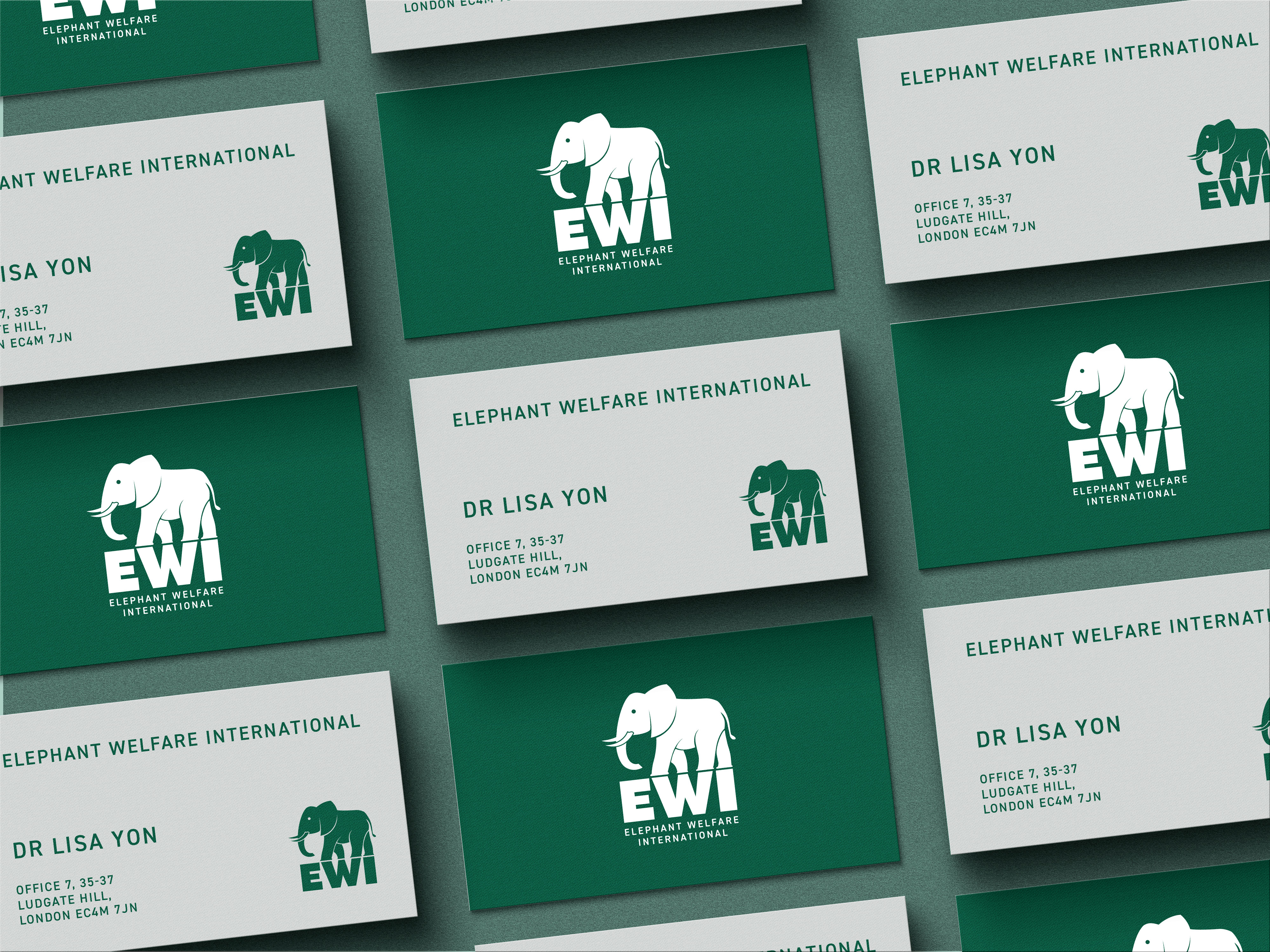
We started by creating a new logo and full brand by focusing on earthy, natural colours and elephant iconography, before rolling this out to a full website complete with a donation system. During the process, we assisted with tone of voice development and got to create some adcepts which we’re also super proud of. For Elliot, this had the added bonus of bringing back fond memories of his many years in big city advertising agencies.
Shayla’s favourite project
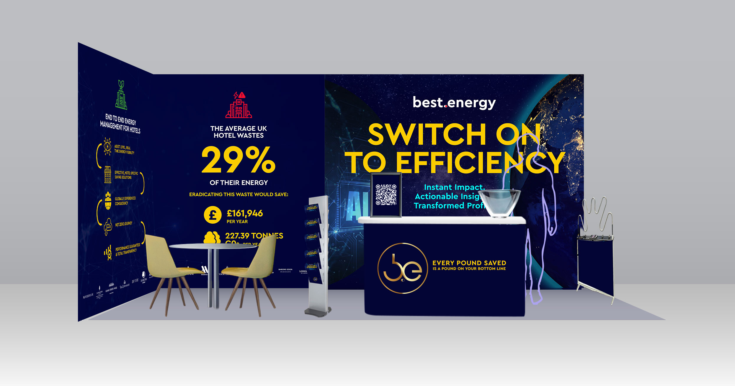
Best.Energy exhibition stand
Best.Energy, one of our longest standing clients, has found increasing success in the hospitality sector in the last few years. As such, they decided to attend one of the biggest hotel exhibitions in the UK – Hotel & Resort Innovation Expo at the Excel in London. Being the first exhibition they’d had attended in a while, it was up to the Roots team to develop an attractive, eye-catching trade stand to represent the team at the show. Having created the brand a few years ago, we’re super comfortable with Best’s identity and knew this was an opportunity to create something awesome.
Shayla completely oversaw the project management of this, working with the client and our Design Lead Paul to ensure we created something suitable, sustainable (to fit the brand ethos), reusable and cost-effective. She handled everything from the design liaison to print management, as well as additional assets that needed creating – informative leaflets, a golden ticket to incentivise sign-ups from potential leads, and landing pages for the QR codes to lead back to.
Better still, Shayla got to see her hard work in-person by visiting the exhibition in London!
Tye’s favourite project
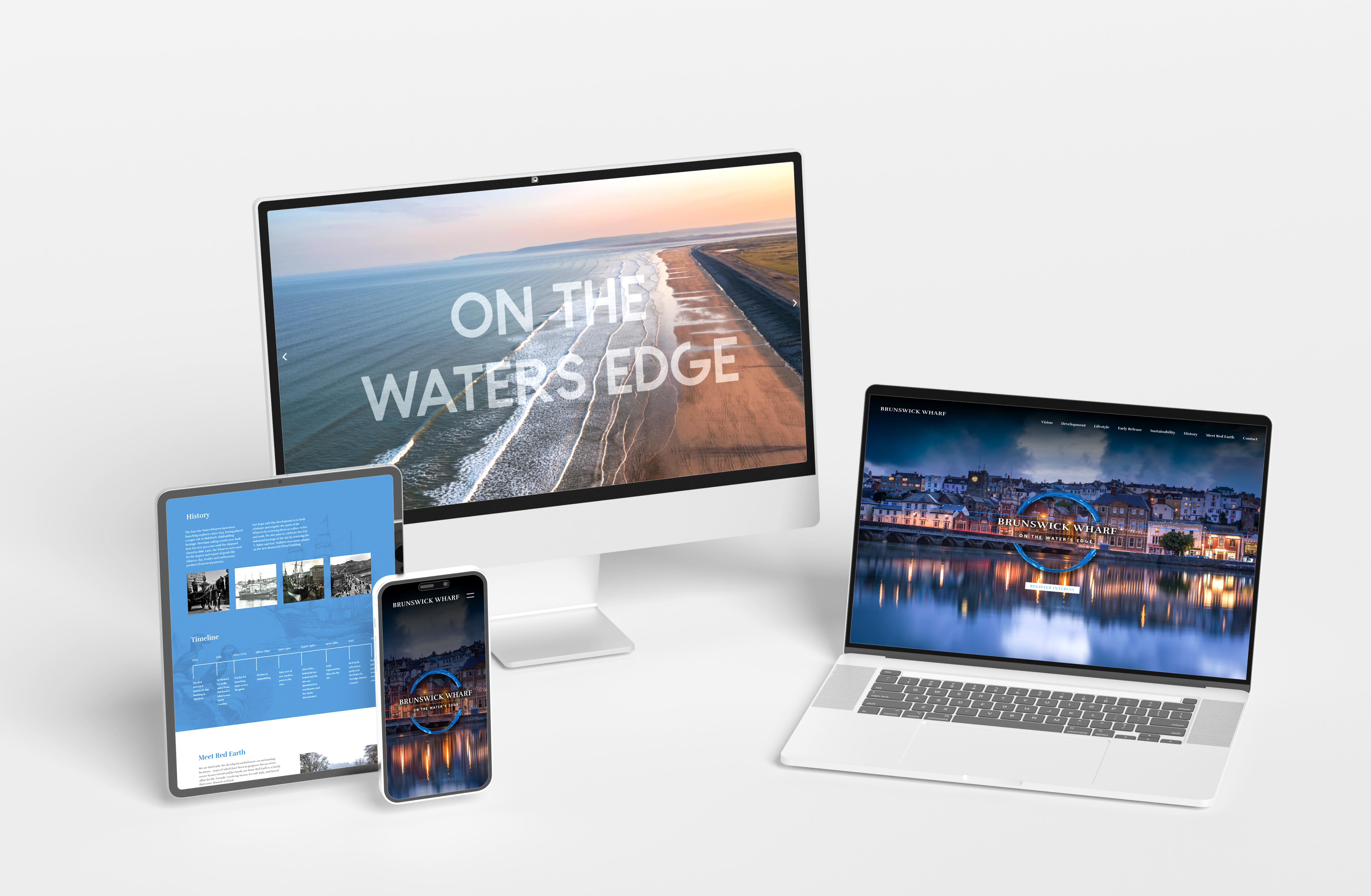
Red Earth Developments & Brunswick Wharf websites
For our web developer and technical mastermind, Tye, the highlight this year was the twin websites we created for our friends at Red Earth Developments. These South West-based property developers are working on regenerating the derelict Brunswick Wharf site here in Bideford, building new waterside homes along with commercial spaces and a vibrant community hub – so we have a lot of time for them.
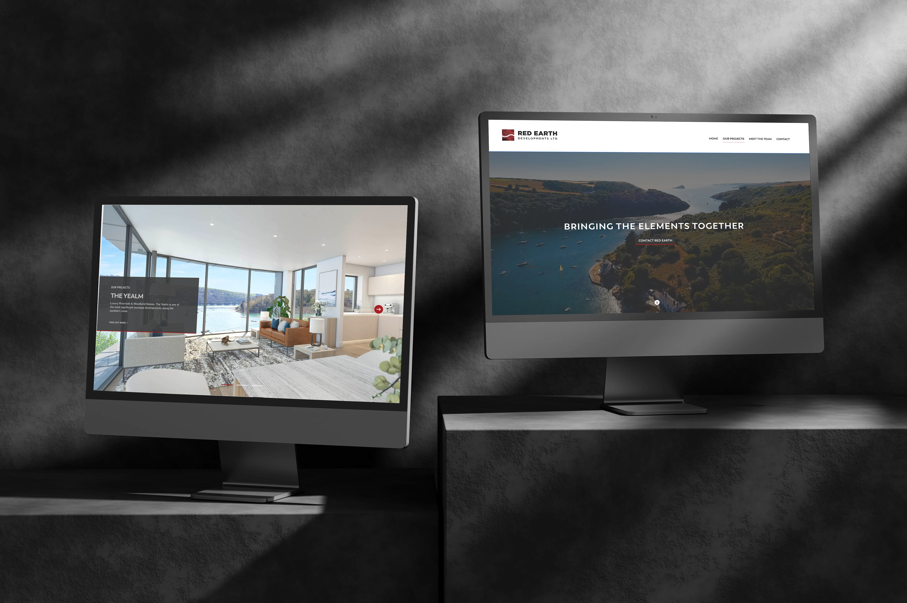
Red Earth needed a general portfolio site to showcase their brand and builds, as well as a dedicated website for Brunswick Wharf. The Brunswick Wharf website would share information about the project, the rich history of the site, as well as acting as a lead generation tool for advertisements that we’d be running. As such, it required a specific property CRM which Tye learned about and implemented, adding yet another tidbit of expertise to his ever-expanding technical knowhow.
Myles’s favourite project
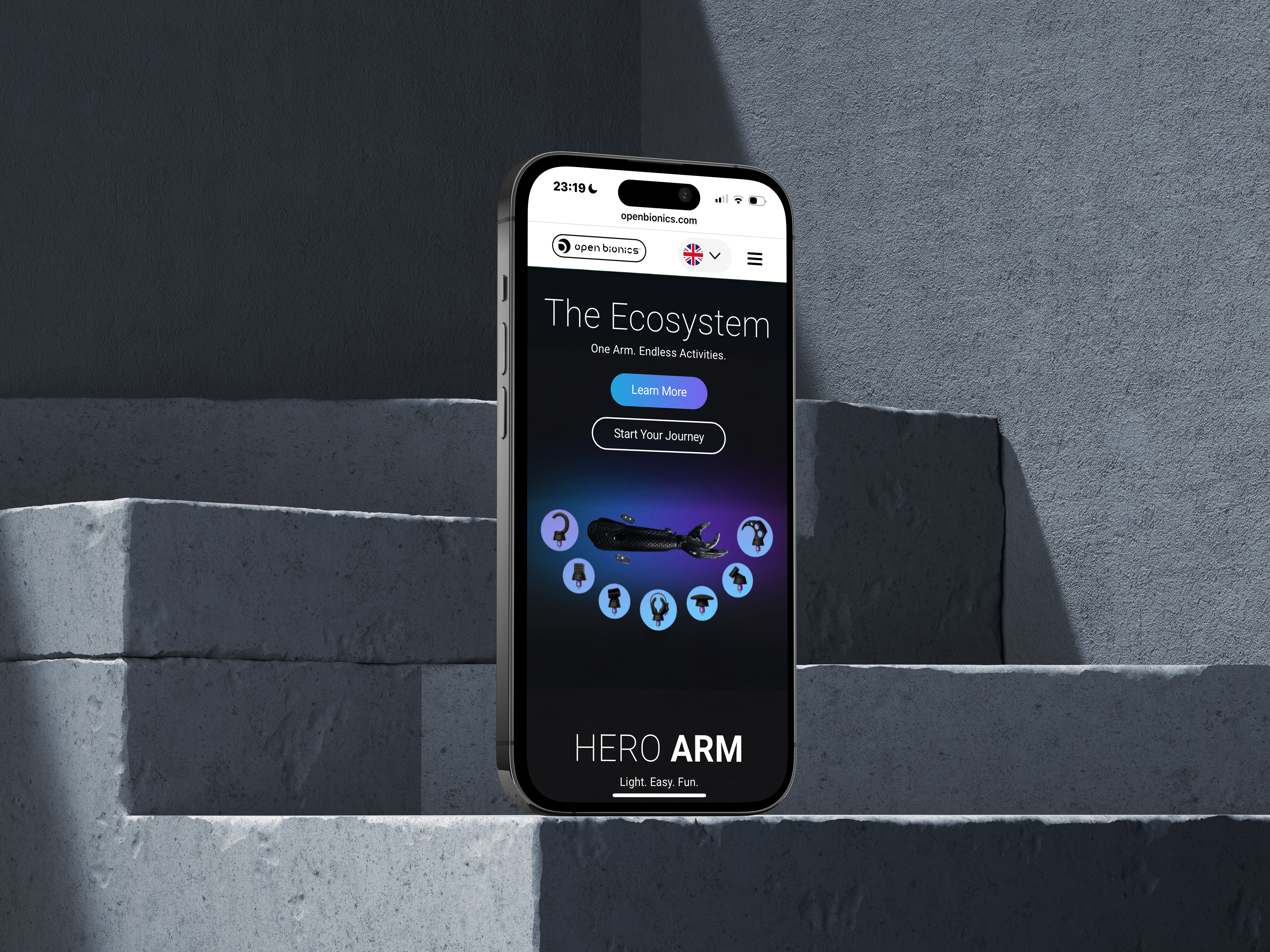
Open Bionics product launch & digital marketing campaign
We’ve worked with Bristol-based bionics company Open Bionics for a while now, and they’ve always been one of the coolest brands we work with. They create innovative tech products for people with upper limb differences across the UK, Germany and the US, and we’ve always enjoyed working with a brand that makes such a significant impact on people’s lives.
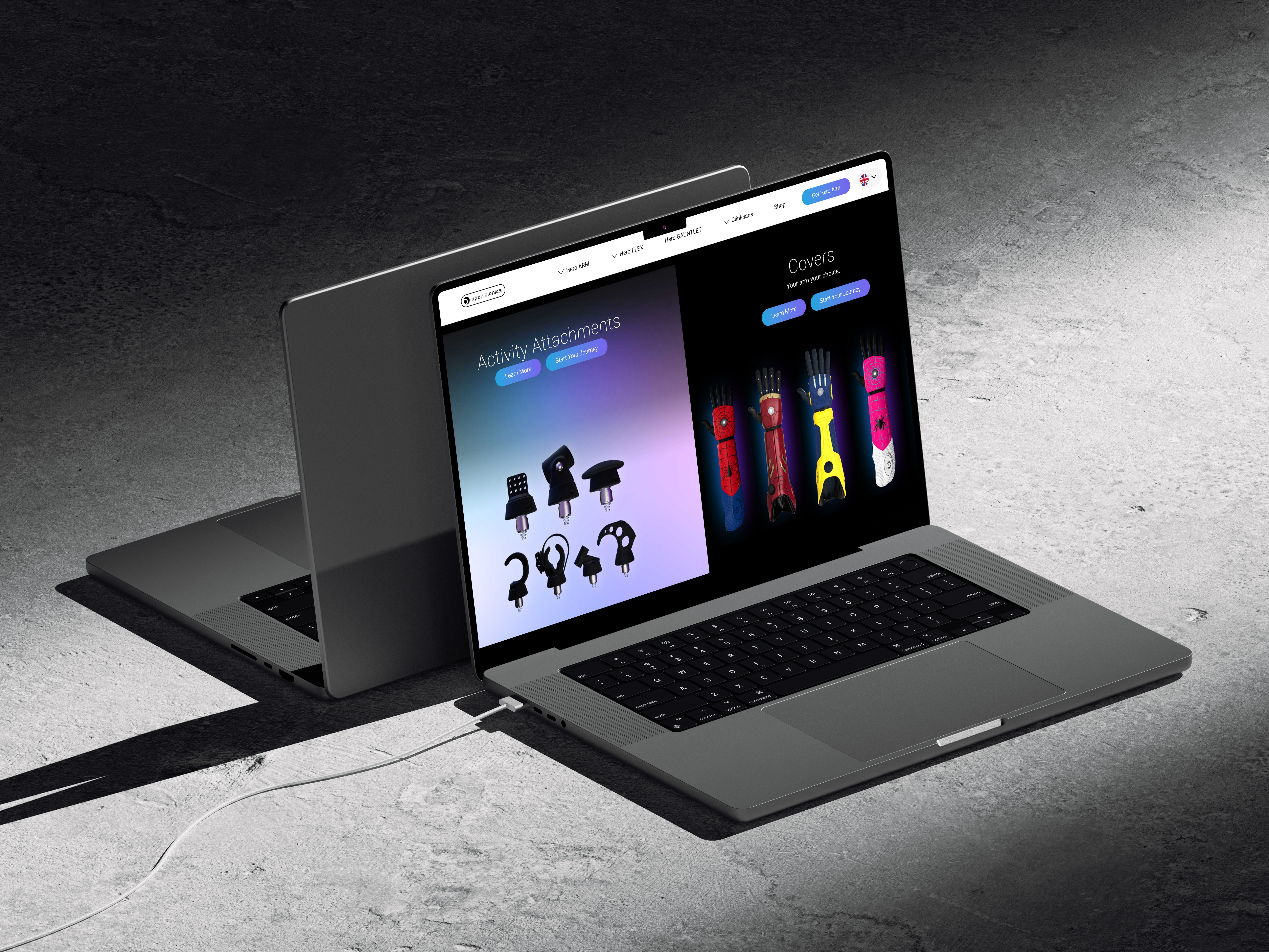
2025 has been another exciting year for the Open Bionics team. They’ve expanded their range, now offering additional products for those with different upper limb differences, as well as activity attachments making it even easier for people to work and pursue their favourite hobbies, be it kayaking, mountain biking or yoga.
As a part of the product launch, Roots created dynamic new page modules to showcase the tech in the most impactful way. Myles was kept busy with digital advertising campaigns across social media, Google and Bing, making it easier to spread the brand’s important message, and achieved some of our strongest paid advertising results of 2025 in the process.
Georgie’s favourite project
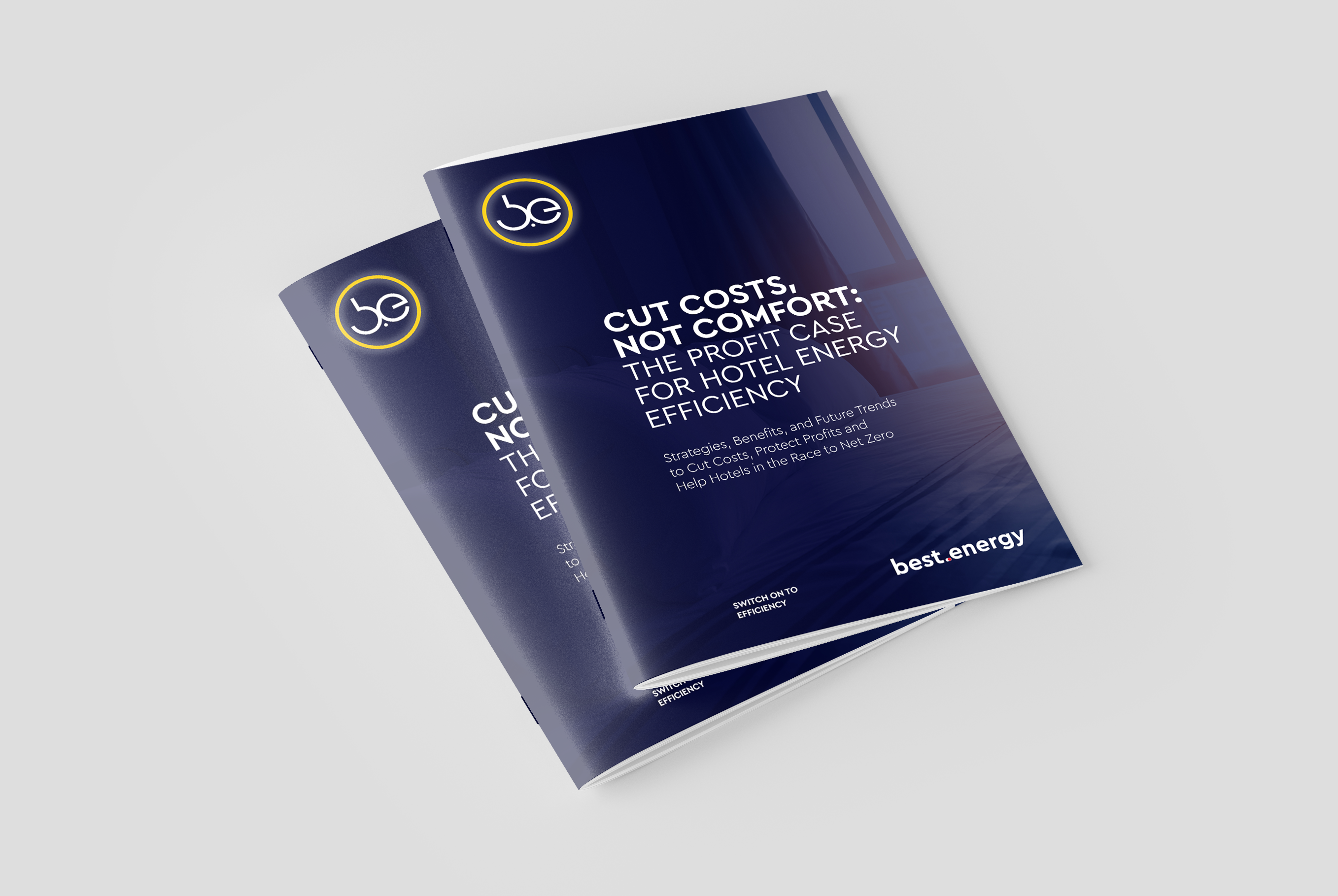
Best.Energy whitepapers
Best.Energy had another pretty major project this year which required us to create two full whitepapers on commercial and industrial energy efficiency in the hospitality and manufacturing sectors. These were the full package: in-depth, unique research carried out for each sector, 70+ footnotes between them, thousands of words, and most importantly, enough knowledge to best others in future debates about climate change.
Once the copy was complete, we created beautifully designed PDFs for digital distribution, complete with original diagrams and pullouts of particular stats for maximum impact. We’re now in the process of creating a dedicated whitepaper landing page to use in advertising campaigns across Google and LinkedIn, and we’re excited to see how these benefit our lead generation campaigns.
Georgie loves creating in-depth, long-form content, so this was a dream. Especially since she got to drink excessive amounts of iced coffee in Costa while doing it.
Paul’s favourite project
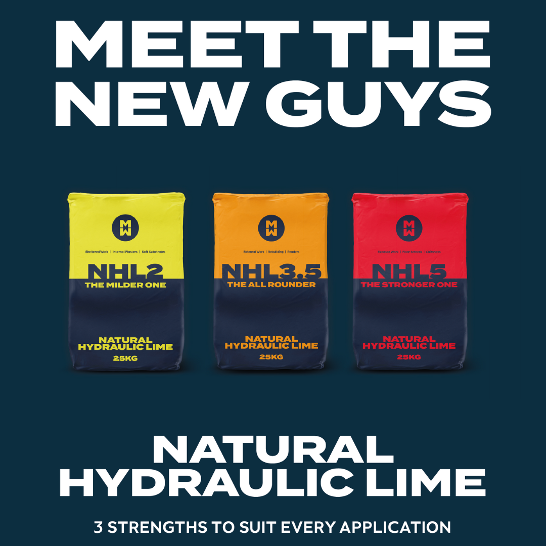
MW (Mike Wye) brand and product launch
As our Design Lead, Paul is used to making things look good – even, or especially, when they’re things that the average consumer might not find so exciting. This was 100% the case for Mike Wye, which we also covered in more detail in another blog.
They approached us with an exciting opportunity to release their own Natural Hydraulic Lime range, but the last thing they wanted was another building materials bag that disappears into the shelves. They also couldn’t launch the brand underneath the existing Mike Wye name as a decent amount of the target audience would be their usual competitors.
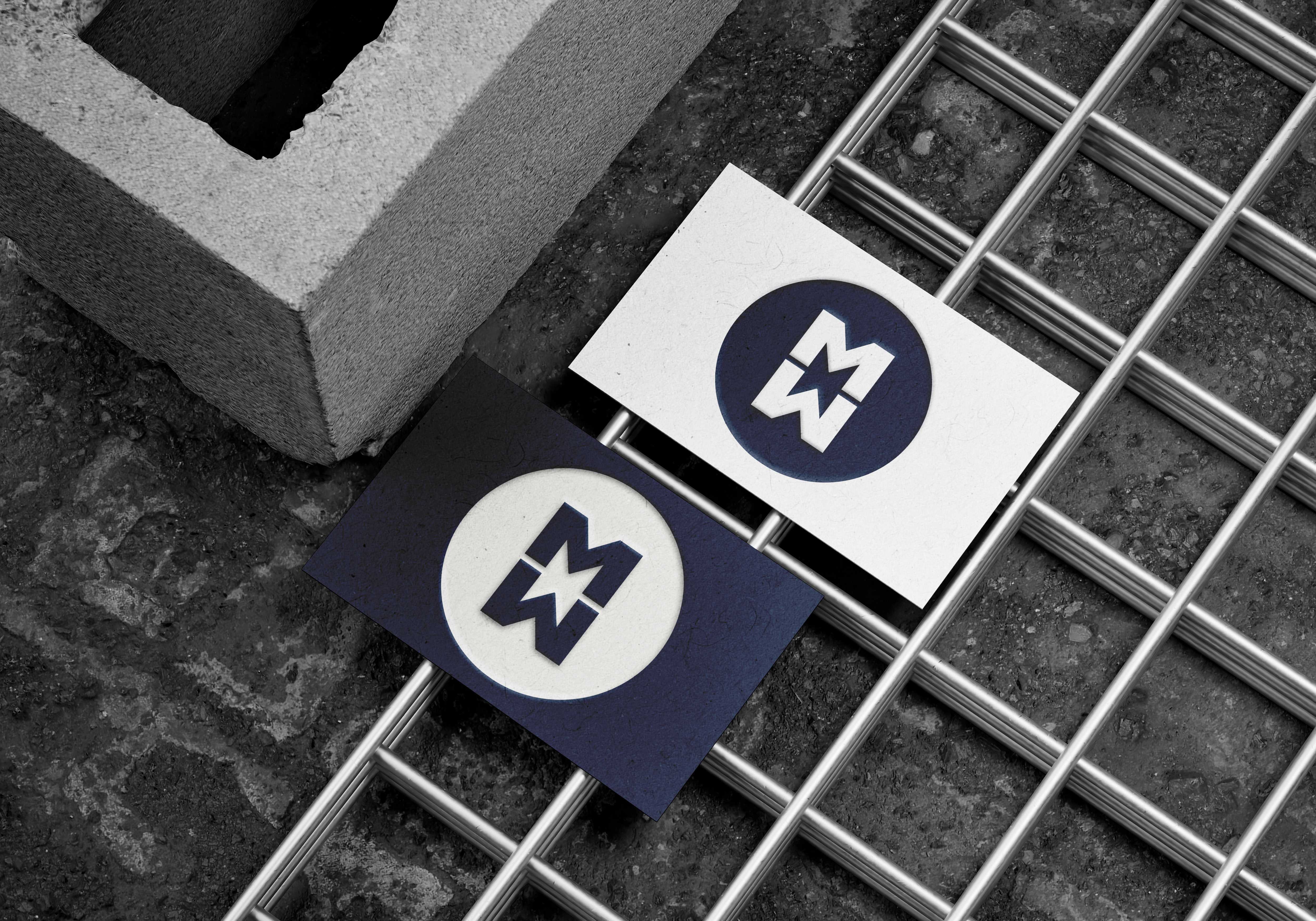
For the brand, we created ‘MW’ – a sub-brand still loosely linked to the parent brand through the navy and blue colours. Because MW would only be releasing the NHL products, the bulk of the creative work came in the packaging design for these three products: the different grades of NHL which would guide the branding and represent the different strengths in a traffic light system. This would simultaneously make finding and purchasing the correct product much simpler for consumers.
We’re super pleased with how these turned out!
Upcoming in 2026
We’ve just finished an exciting rebrand project for a local not-for-profit that provides support and advice to local business owners across Devon and the wider South West. We’re all about supporting our North Devon community, so this was a huge winner for us. We’re extremely happy with the end result, and a significant website build is now underway too – so we’ll definitely be shouting about this one once it’s done in the New Year.
It’ll be another big year for websites in general. We’re currently in the process of working on a substantial website project in corporate construction, and a couple of our existing clients have new website projects kicking off too. In the meantime, we’ll be kept happily busy with our client retainers across web development, digital advertising and design. Plus, we’ll be breaking into some new areas – Shayla has just begun flexing her Gen Z credentials by taking over social media management for Honey Source, and we can’t wait to see the accounts grow.
A big thank you to all our clients, long-standing and brand new, who have worked with us this year. While we’re all ready for some well-deserved R&R, we can’t wait to keep our brains busy with more creative work in 2026!