Six sweet months: Launching a website and brand for Honey Source.
Georgie Cunningham Client Relationship Manager
Published
It started with an email
We’ve been lucky enough to work with local legends Quince Honey Farm since 2017, so when Ian Wallace approached us in November 2024 with a new venture, we couldn’t wait to get involved.
That venture was Honey Source: a brand new UK honey company. Being a completely new business, this was an extensive project for Roots, especially since it also required the creation of three new sub-brands within the overarching project.
In total, we created four new brands, two landing pages, one full website, a LOT of packaging, as well as a marketing campaign to truly get Honey Source off the ground.
What is Honey Source?
Honey Source is an online emporium for the best of British honey. They partner with bee farmers across the UK so that British people can get delicious, local honey all in one place. There’s a wholesale element here too: retailers can purchase wholesale honey from any one of the Honey Source brands.
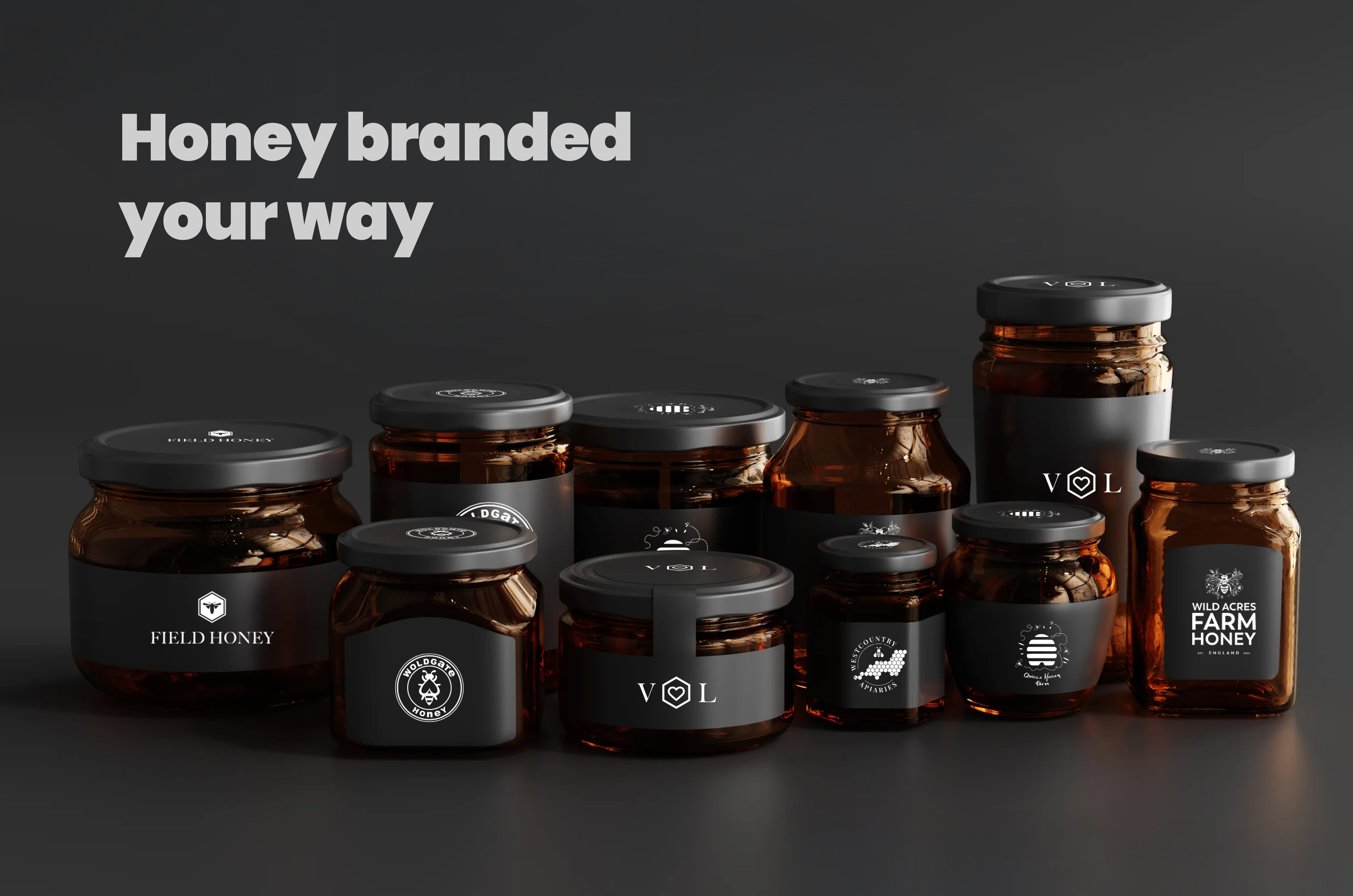
Honey Source has a few own-brands under its umbrella, so they can provide honey in bulk at a cheaper price point, making it accessible to more consumers.
There’s Wild Acres Honey, an English honey brand wherein a jar of which could contain honey from any Honey Source farm, and Westcountry Apiaries, which does the same but the honey is sourced exclusively from the good old West Country.
The idea is that although the weather in the UK is often questionable, it’s always sunny enough somewhere during honey season that a farmer can contribute surplus honey from their annual crop.
Why does their mission matter?
Even though we see honey everywhere – on supermarket shelves, in cafes – most of it is not British honey. Actually, most of it technically isn’t even honey: a test by the Honey Authenticity Network showed that 90% of the samples from big British retailers were likely not genuine honey.
Honey Source believes in celebrating British bee farmers instead, ensuring:
- That British bee farmers are paid what they’re worth.
- That British customers get the health benefits provided by pure, local honey.
- That Britain’s biodiversity is boosted by local bee farms.
With our Managing Director, Katie, having grown up on Devon’s agricultural farms herself – and sustainability being a big part of the Roots ethos more generally – it’s a mission we can absolutely get behind.
Branding and Design
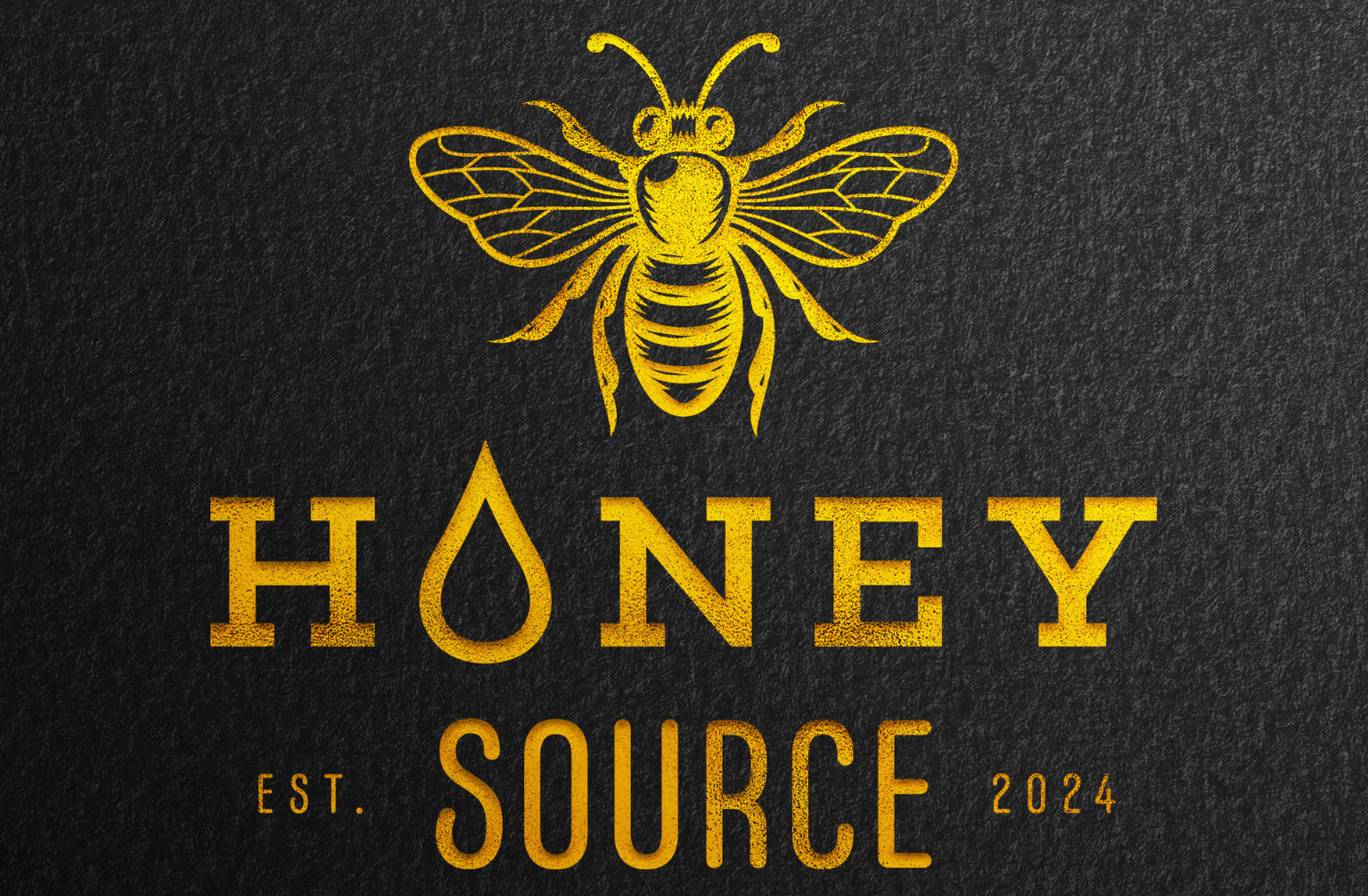
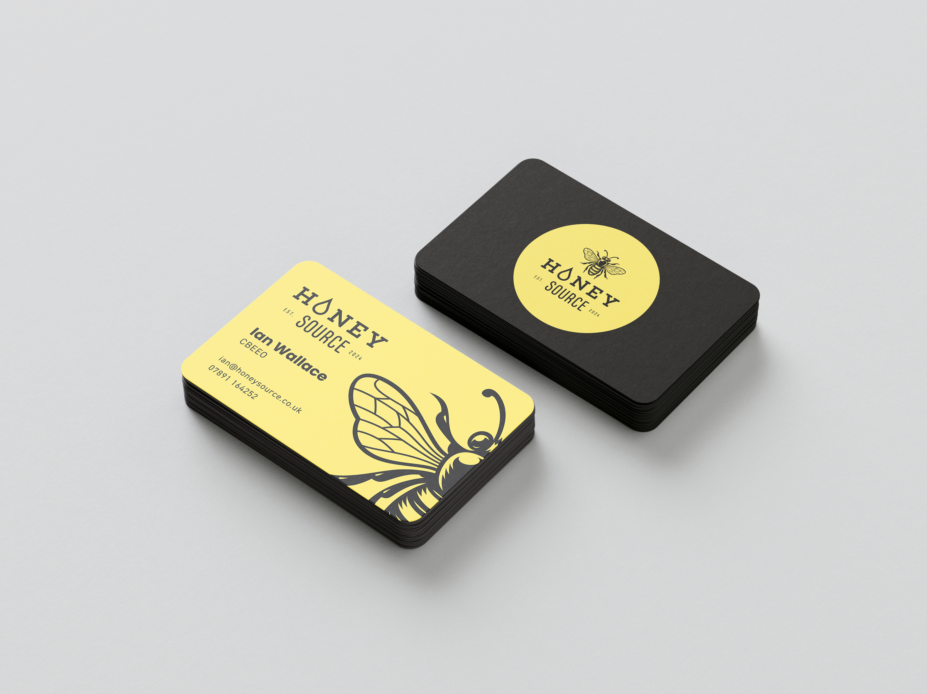
Honey Source
The first place for us to start was with the Honey Source brand. We started with grayscale concepts to define the look-and-feel of the brand, then developed and refined based on feedback from the client.
This involved combining elements from a few of the different concepts, as well as removing ‘England’ from the logo so that Honey Source could represent honey farmers from all around the UK. The logo that we eventually chose combined one of the original font pairings with an illustrative bee that was further developed to feel more adaptive to different formats, and to suit the more modern and dynamic font chosen.
While Honey Source is an online store, the brand needed to work in print too: both for business cards, brochures and letterheads for partner farms and wholesale customers, but also to enable the possibility of creating other brands within Honey Source that could eventually end up on the shelves too.
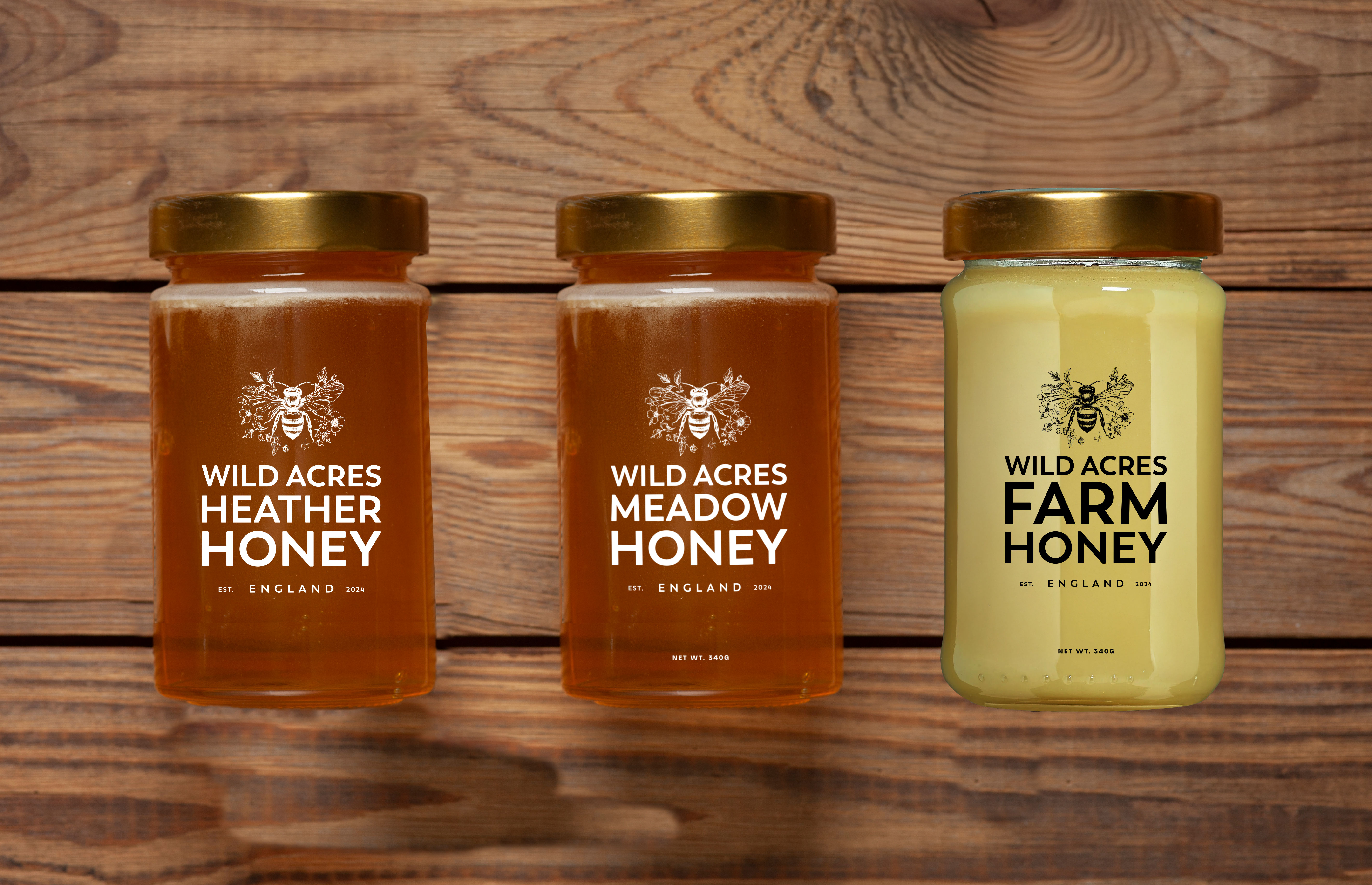
Wild Acres Honey
When we got the brief for Wild Acres, it wasn’t yet Wild Acres. So the first step here was a brand naming workshop.
We wanted something that encompassed and celebrated the UK’s countryside and moors, the places in rural Exmoor and Scotland where farmers take their bees to harvest nectar. We also wanted something that sounded high-end, reflecting the quality of the various honeys despite being more cost-effective than single-origin honey typically is.
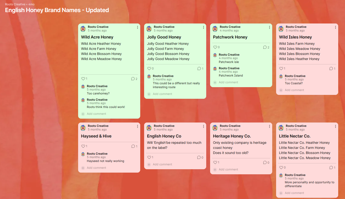
Our three finalists were Wild Acres, Jolly Good Honey and Patchwork Honey, so we created labels for all three so that we could see the brand name in situ. This was what helped us to choose the final name – Wild Acres Honey – and the first look of the logo, which would need to be versatile enough to fit smaller jars, bigger tubs for bulk buying and wholesale, as well as digital formats like the Wild Acres landing page and the Honey Source website.
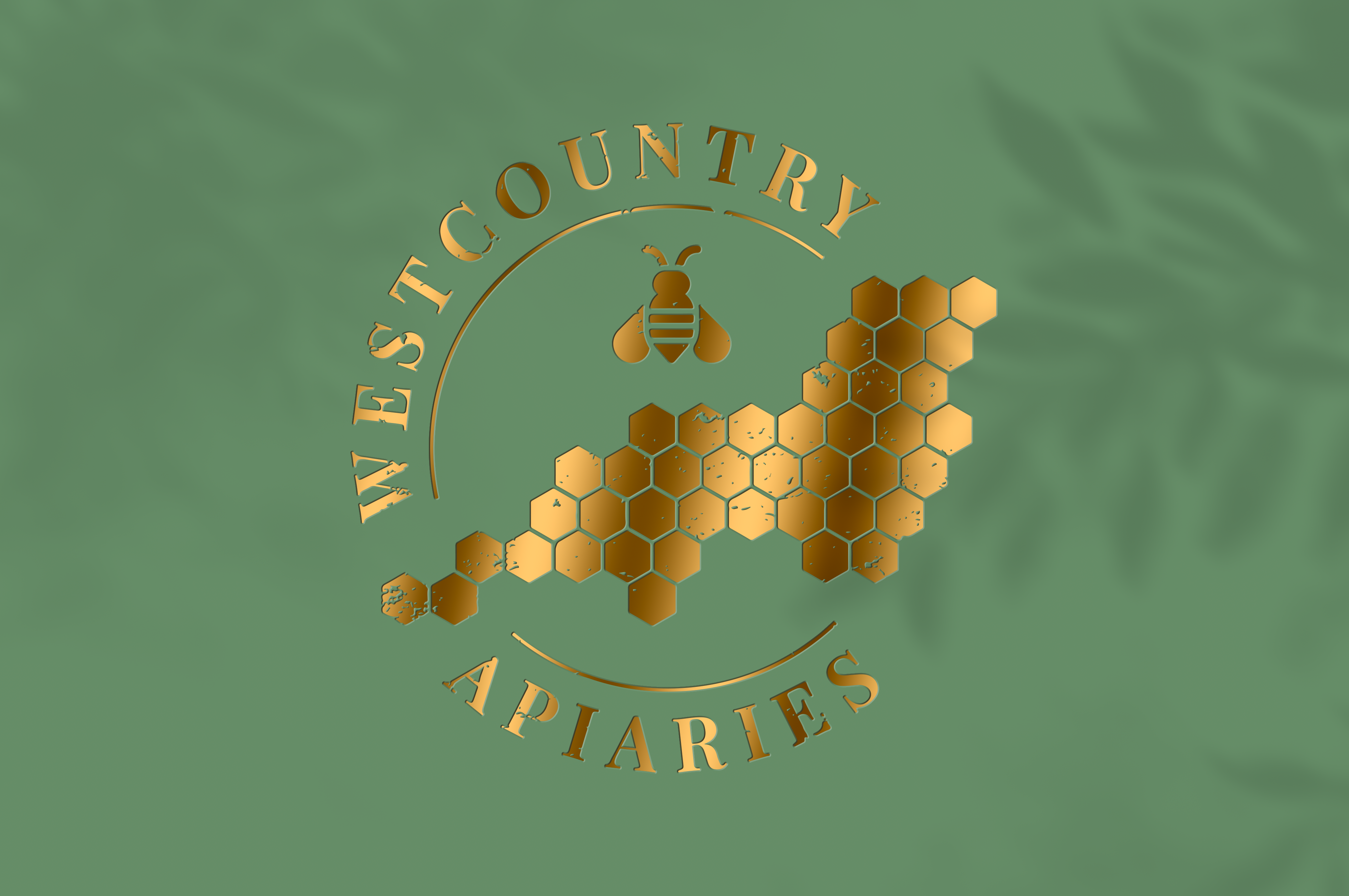
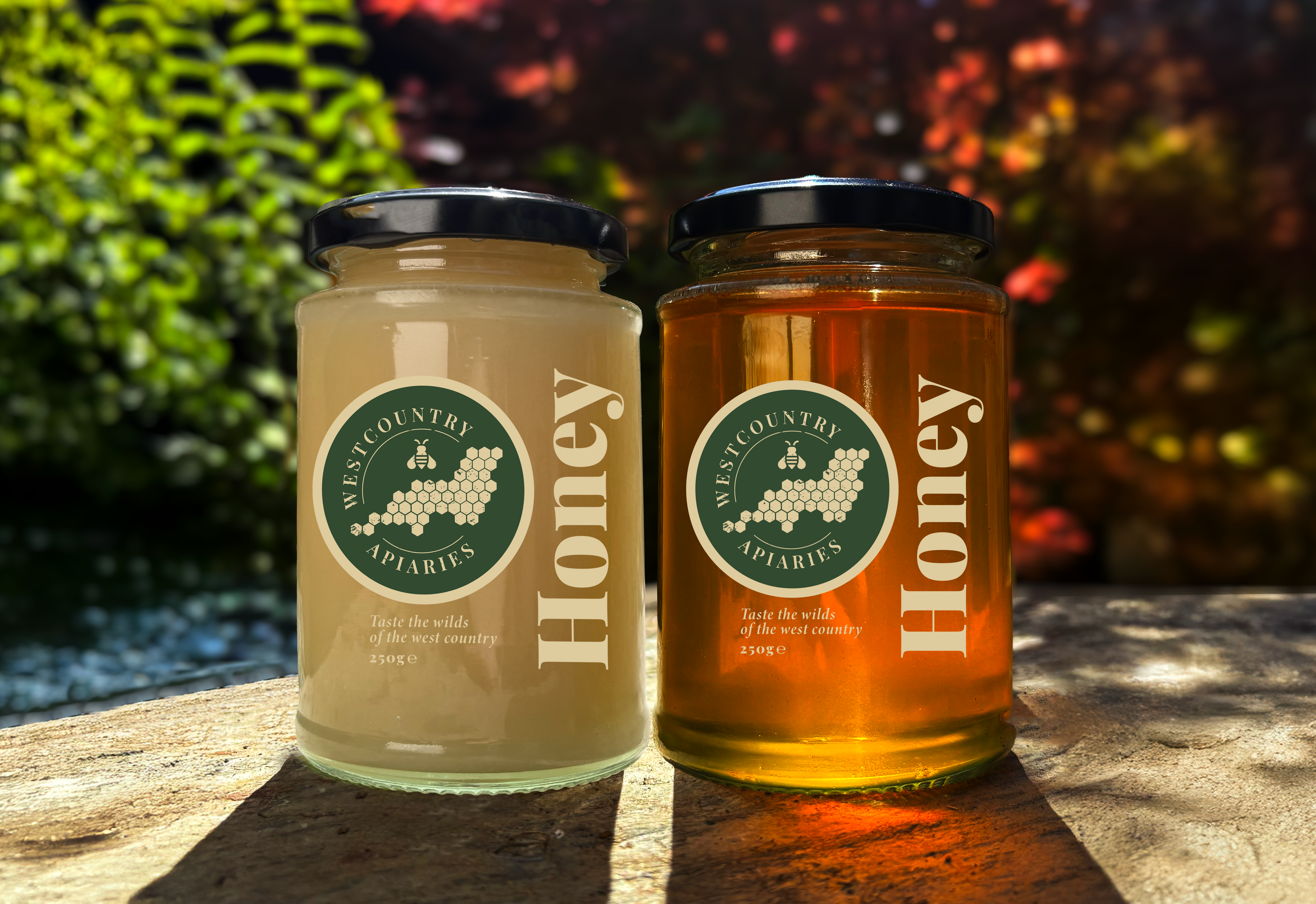
Westcountry Apiaries
For the Westcountry Apiaries brand we had two key considerations in mind: firstly, it needed to be positioned as a slightly cheaper option than single-origin honey, while simultaneously establishing its quality. Secondly, it needed to be clear that while the honey could come from multiple origins, it was 100% West Country honey, and that this was a significant part of the brand and its story.
The logo that we came up with meshes the premium and the rustic, combining a map of the West Country with honeycomb shapes, as well as a bee illustration (for obvious reasons). We chose a serif font so that the products would feel both traditional and artisanal.
Story and origin are key components for this particular brand, and we wanted to convey that story on the jars themselves. We came up with the tagline ‘Taste the wilds of the West Country’ to allude to the wild, rugged landscape – the coast, the acres of hedgerows, the sweeping moorlands – from which the honey has been harvested. We also wrote a brief blurb for the brand that would sit on the jar for every product, further drawing on the wild beauty of the South West.
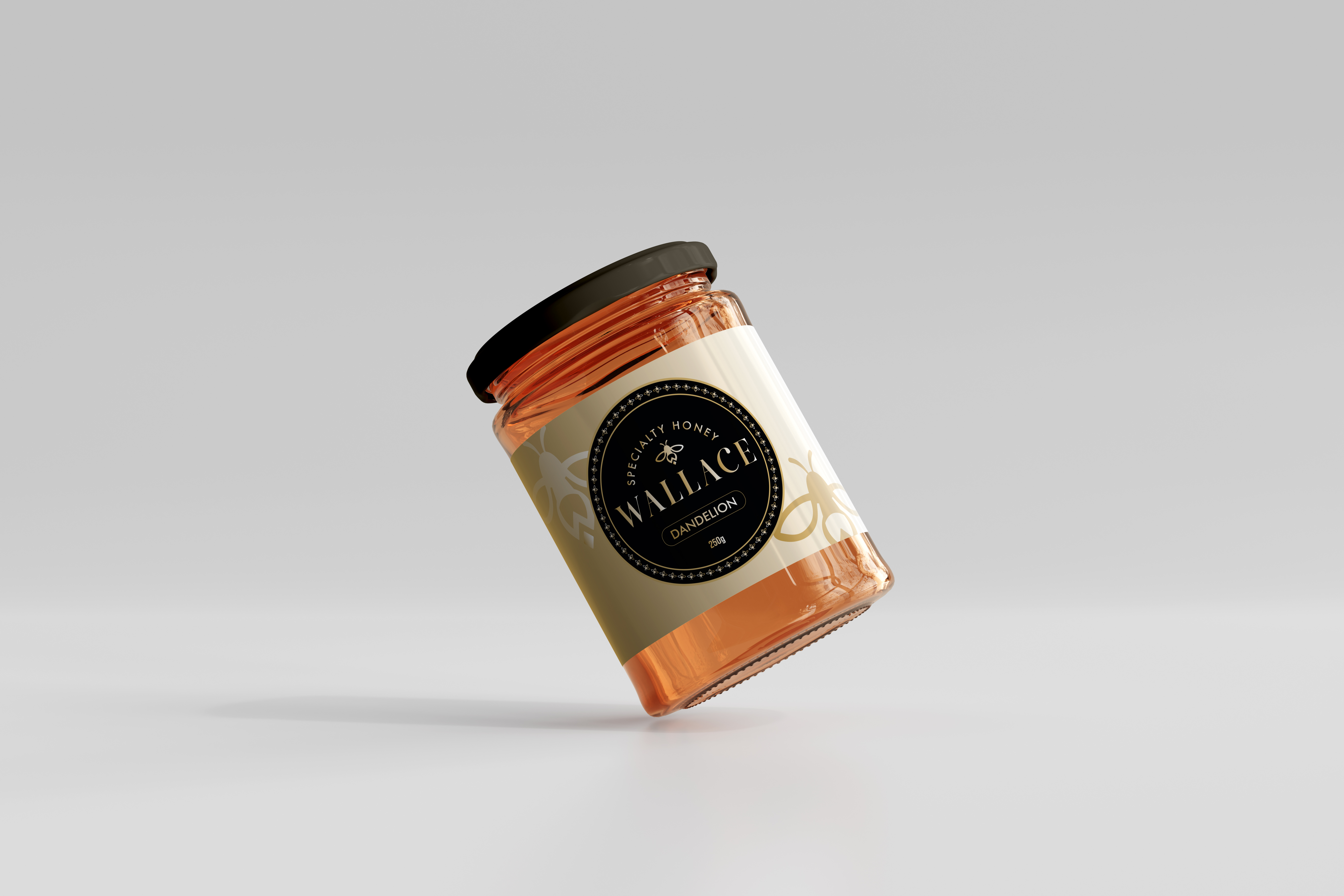
Wallace Honey
We also put together a logo for a specialty honey from Ian and Paddy Wallace at Quince Honey Farm – the aptly named Wallace Honey.
For this particular brand we began with one of the concepts not chosen from Westcountry Apiaries, before refining it in order to create a more opulent aesthetic that’d suit a specialty honey. The brand name, Wallace, is capitalised and heightened to showcase that this is a heritage brand and a family product, reflecting the decades of bee farming expertise held by the Wallace family.
As these are specialty, higher-end products, we focused on a premium colour palette: cream, black, and gold.
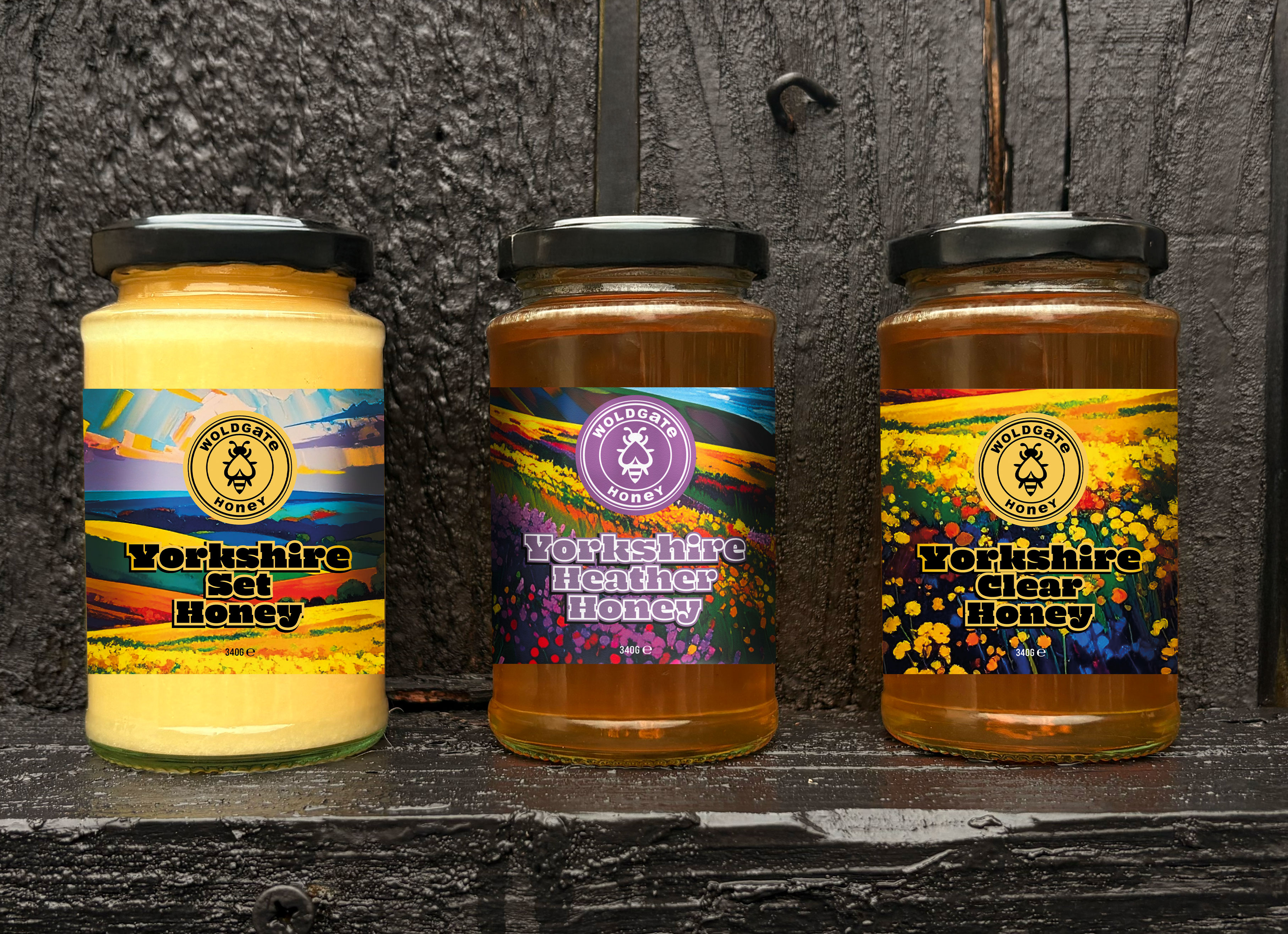
Woldgate Honey
Finally we worked with Mark Woldgate of Woldgate Honey who wanted to refine his brand and packaging before his products became available on Honey Source. Woldgate Honey already had an existing brand, so we developed this rather than starting completely afresh.
While we kept the existing Woldgate logo in place we created eye-catching new labels for the jars. For these we went for a much more vibrant aesthetic, using bold colours and illustrations of the Yorkshire landscapes where Mark keeps bees (including the North York Moors, where he produces his famous Heather Honey) with a particular nod to the countryside and crops.
Website
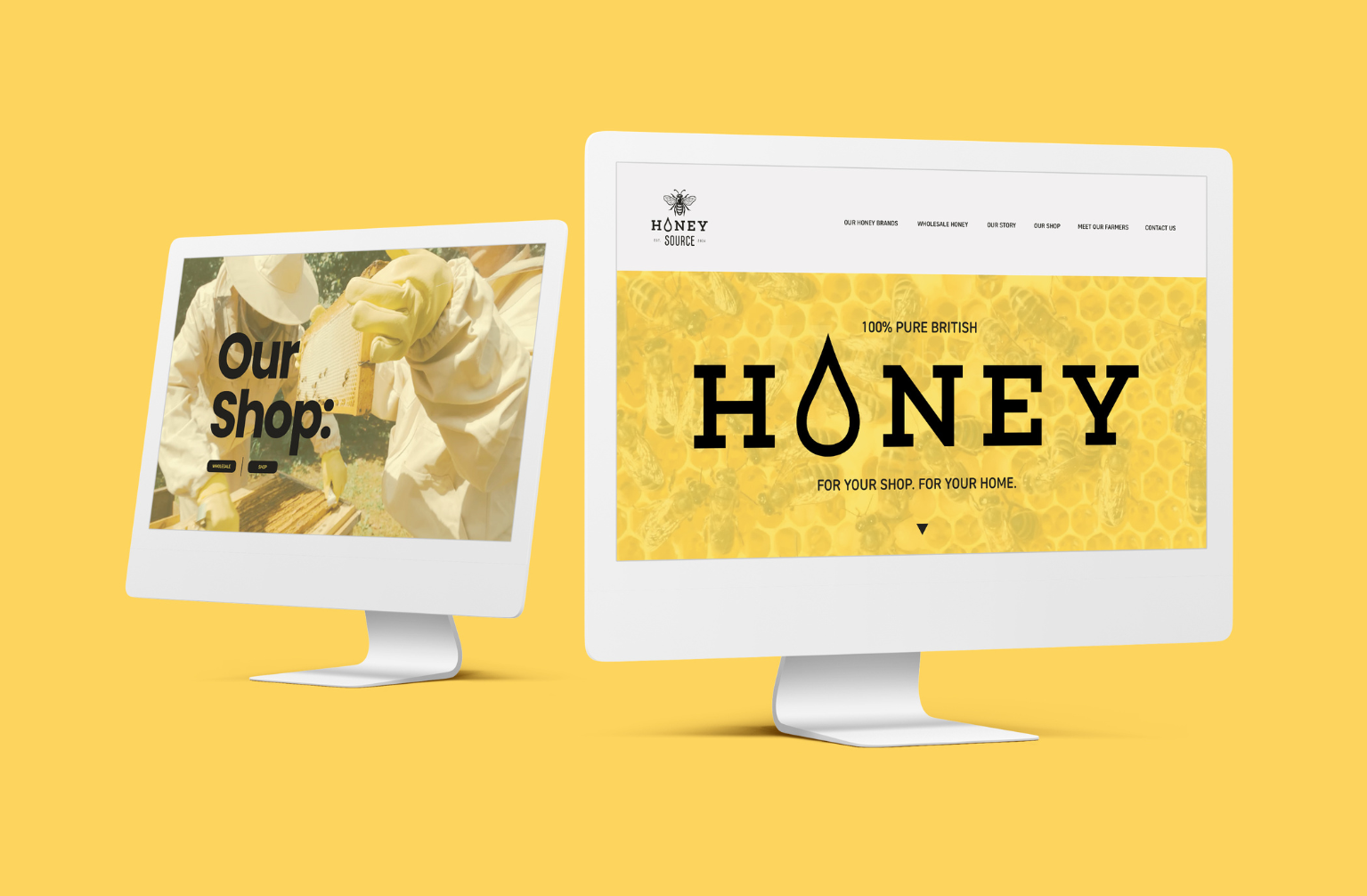
Once the brands had been fully developed it was time for us to get started on the website. Honey Source is an entirely online store, with no physical premises, so creating a seamless user experience would be crucial.
Paul, our Design Lead, created the initial site design with UX in mind, using intuitive navigation, clear CTAs, consistent design and quality imagery and assets. We wrote the copy for the website, optimising for UX and to encourage purchase while staying true to the brand that we'd created.
During the build phase, our Developer, Tye, ensured that the site was responsive, speedy to load, and worked seamlessly at checkout. An increasing number of transactions happen on mobile devices so we ensured that the site was completely optimised not just for desktop but mobile, tablets, and other smaller screens.
We used a WooCommerce integration to facilitate the e-commerce aspects of the site, combined with a Klaviyo integration that would enable order updates to be sent to customers as well as other nurturing emails – abandoned cart notifications, or discount codes to celebrate users’ birthdays.
An important aspect of any new site is discoverability, and SEO was our focus for this. We carry out technical SEO work as standard in any web project, and we also undertook keyword research, keyword mapping, optimised the site’s metadata and put together a strategy for creating SEO content in the future.
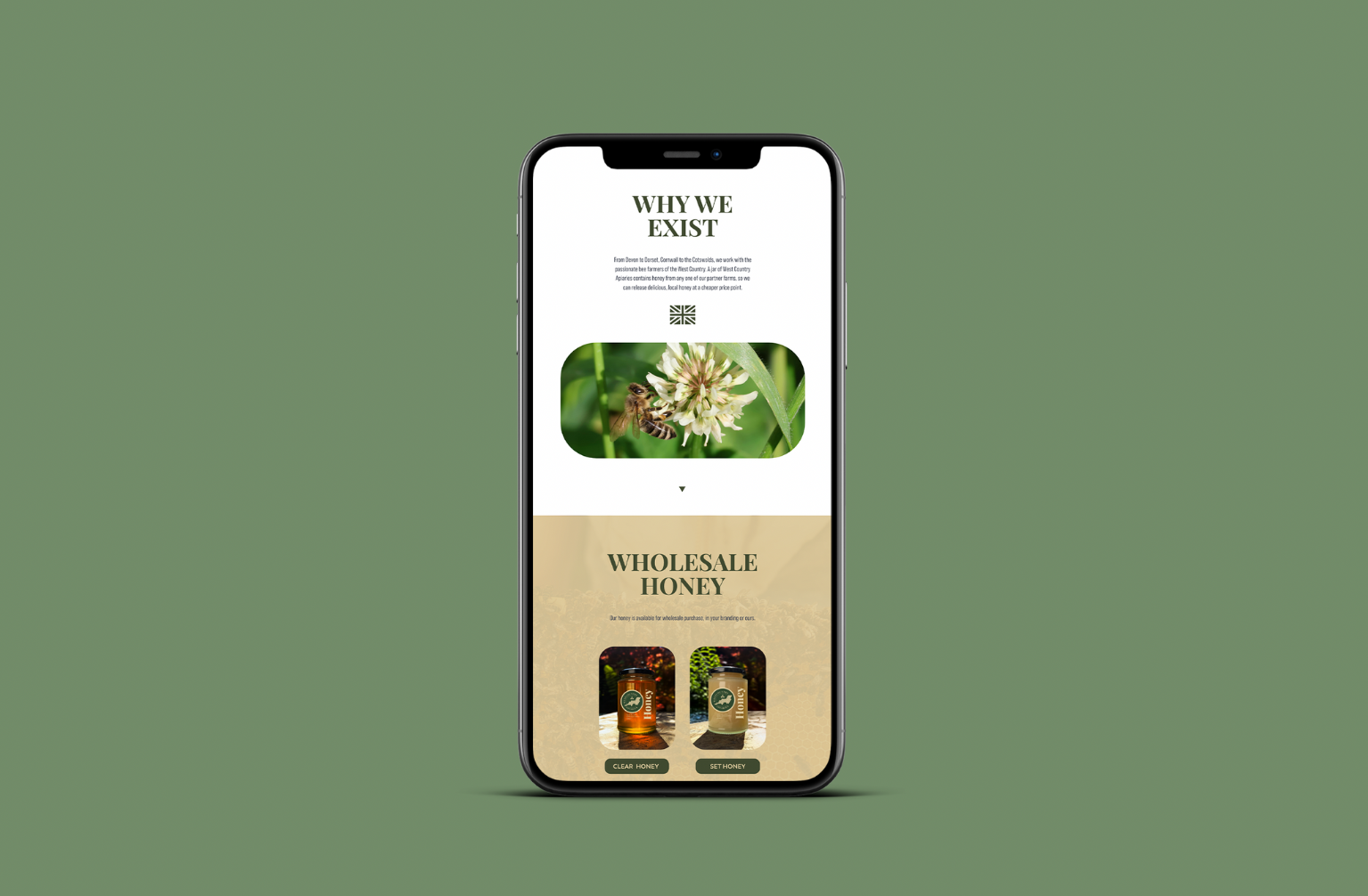
For Wild Acres Honey and Westcountry Apiaries we created simple, one-page sites. These brands can be bought wholesale directly, not just from Honey Source (though both link back to it), so they required space to showcase the products as well as having a contact form for retailers to register interest.
Marketing strategy
Now that the website is live, we’re focused on the next stage of the project: starting to get sales.
We’ve already set up email marketing via Klaviyo and WooCommerce and the usual social media profiles, meanwhile our Ads expert Myles has started putting together a digital advertising strategy. We’ve got a few other ideas up our sleeve for the future too but there’s more than enough to keep us busy for the next few months.
This has been one of our favourite projects to date: we’ve been able to create bold and beautiful work, we’ve had the chance to keep both our strategic and creative brains busy, and we’ve done it all while working with a kind, respectful client.
Honey Source has been a dream so far and we can’t wait to see it develop further. If you've got a creative or strategic project you need a hand with, you can reach us here. Or if you want to stock your kitchen with delicious, 100% pure honey, you know where to go.