
Meet the New Guys: Brand design and marketing for a new Mike Wye product launch.
Georgie Cunningham Client Relationship Manager
Published
The opportunity
Here at Roots our branding projects aren’t always about developing logos, or branding new or existing businesses. We also work on creating vibrant brands for products. So when sustainable building specialists Mike Wye got in touch about an exciting new opportunity to brand and launch a new line of Natural Hydraulic Lime, we were keen as a bean to get involved.
The Brief
Mike Wye are sustainable building and decorating specialists local to us in North Devon. They sell a range of products from paints and plasters to foam glass aggregate, and can also advise on and carry out insulation projects. Their product range includes both other brands as well as their own branded range.
Late last year their Managing Director Ryan got in touch with a unique opportunity the business had been given to import three grades of Natural Hydraulic Lime – NHL2, NHL3.5 and NHL5 – from a long-established French supplier. Mike Wye were keen to market these products under their own branding, and the supplier were happy to go ahead this way.
This presented a fantastic opportunity for Mike Wye to provide their own NHL product that would be able to compete with the existing players. There was one conundrum: a portion of the target market for this particular opportunity would be wholesale, meaning Mike Wye would be distributing to brands who would otherwise be competitors. For that reason, Ryan didn’t want the new range to sit under the Mike Wye brand. Instead, they wanted something fresh and new. And that’s where we came in.
The Brand
Ryan’s idea for the sub-brand was MW: it would retain the same core brand colours, navy and white, maintaining a clear link to the parent brand without being too obvious.
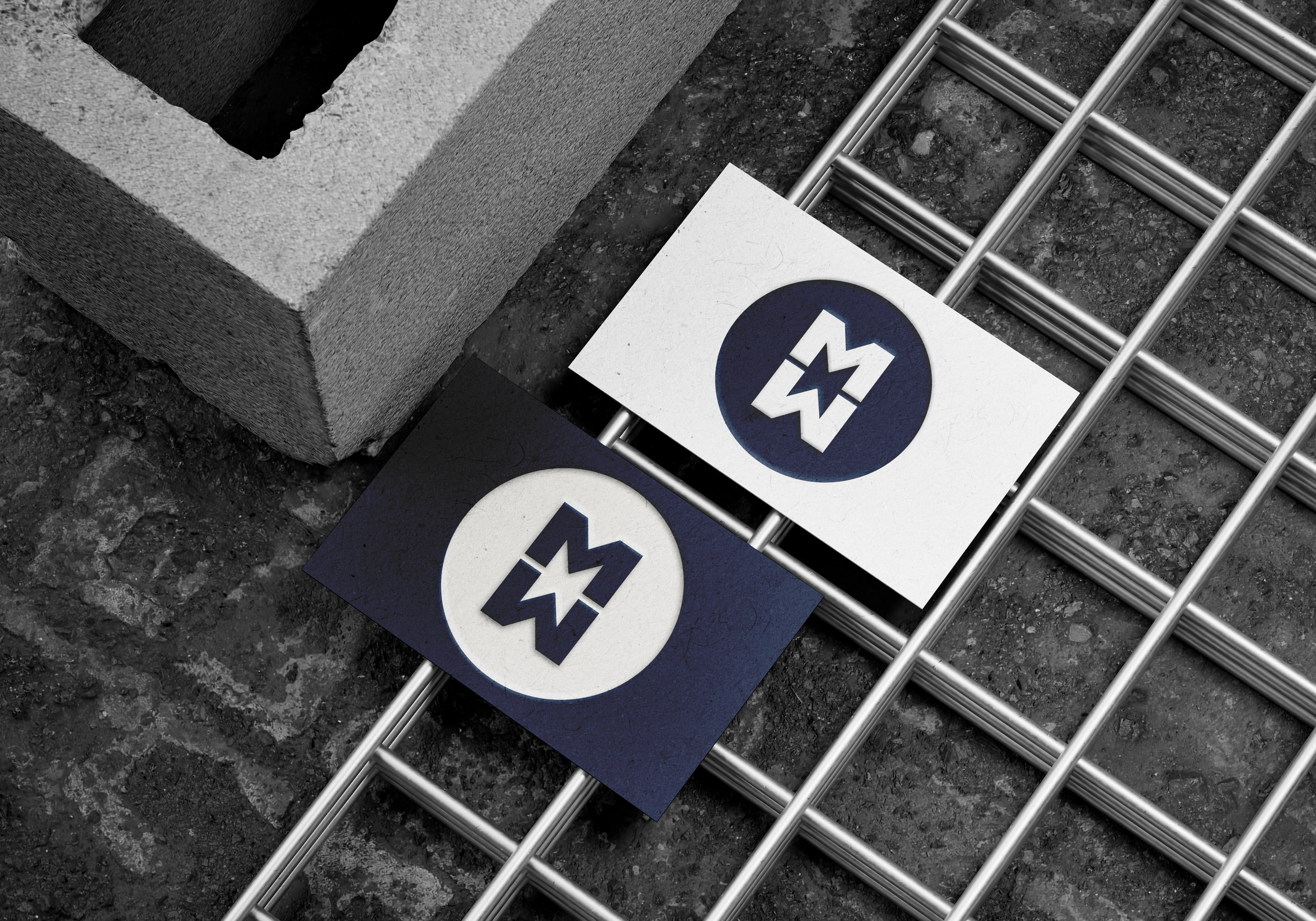
Because the MW brand was required for the NHL line only, the true brand work would come in the packaging design. As there would be three products within the brand, three different grades of NHL, these grades would guide the branding, representing the different strengths in a traffic light system.
The Packaging
The product names would follow the same pattern, specifying their strength in the name to make it as easy as possible for customers to pick the correct product: NHL2: The Milder One; NHL3.5: The All Rounder; NHL5: The Stronger One. For the same reason, the final packaging design would need generic examples for each grade on the bag.
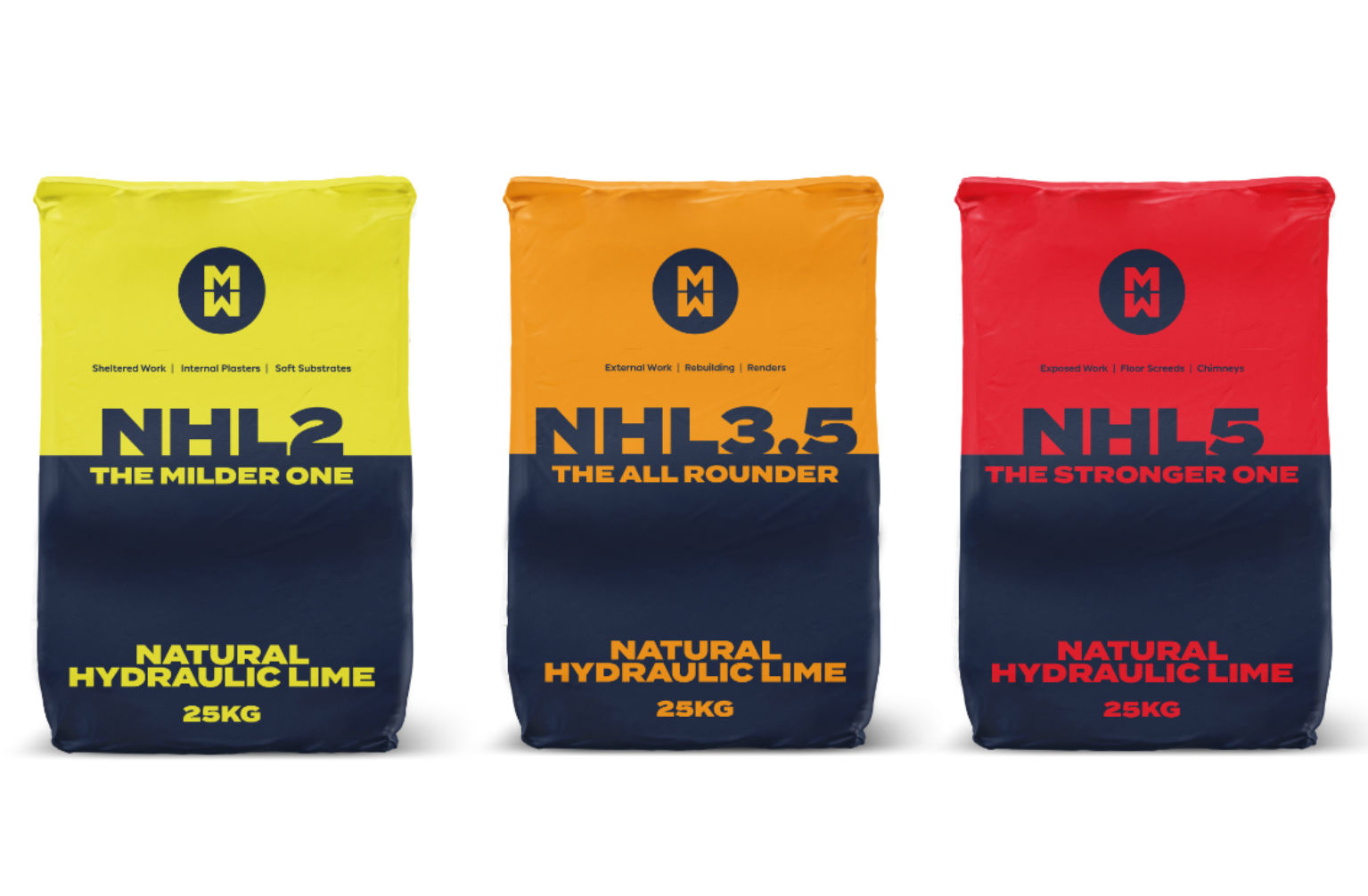
We’re super happy with the styling of these – they’re bold and vibrant, clearly differentiated from others in the market and able to attract attention both on crowded online marketplaces and on the shelf in physical retail stores. Just because a product isn’t mainstream doesn’t mean it’s doomed to have boring packaging!
The Assets
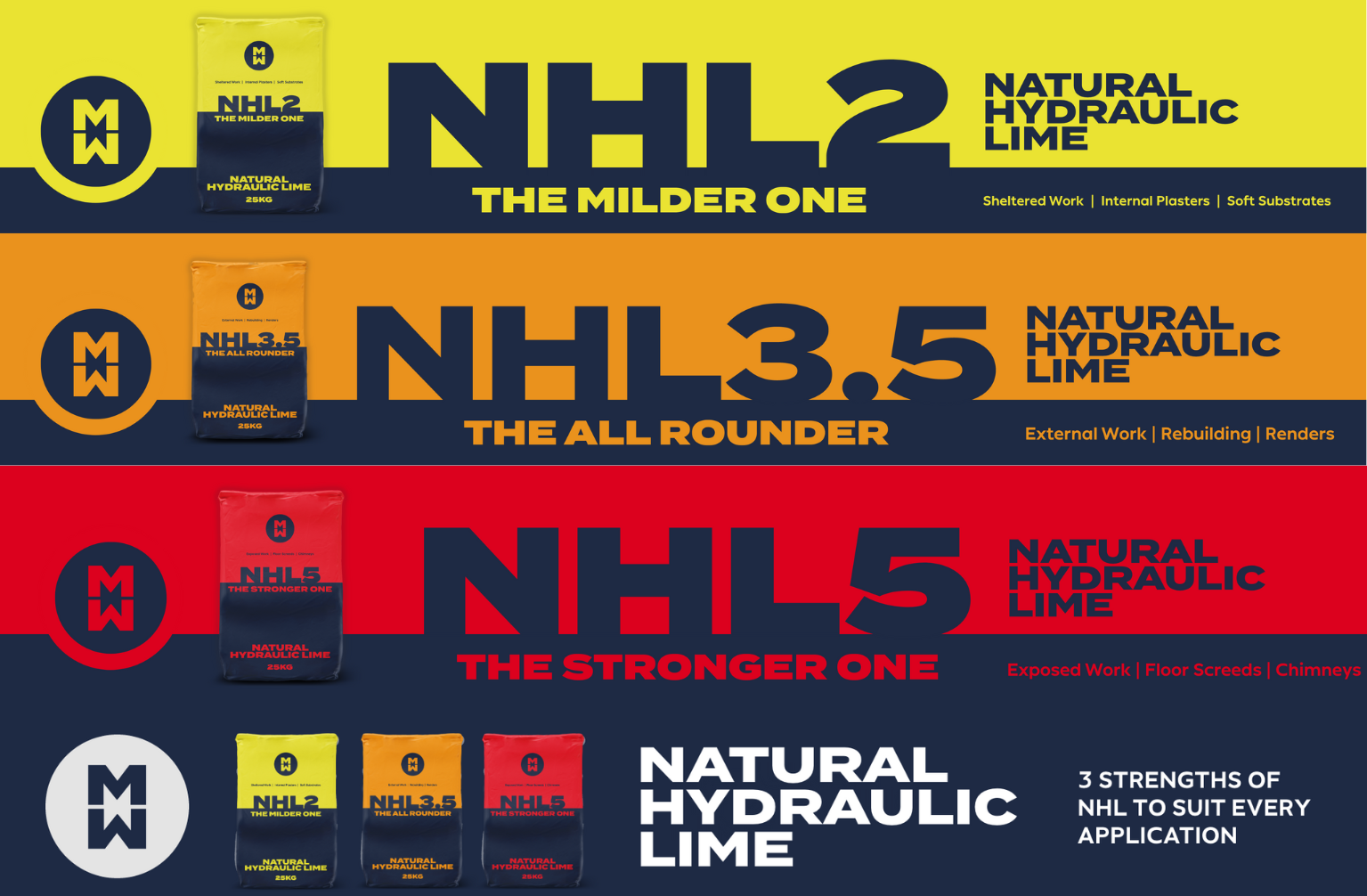
Imposition is always an important part of the branding process, and for this particular project, we were able to do this by creating a variety of marketing assets to help support the product launch.
This included a series of email banners and print ad designs for each product that would be usable in trade magazines or direct mail campaigns. We also refreshed the Mike Wye branded newsletter templates so that these would look fresh and dynamic in the styling of the parent brand.
We’ve since also refreshed the exhibition stand design for various trade shows – again in the style of the parent brand for versatility.
“The team at Roots Creative exceeded our expectations in bringing to life our visions for a new product range. The whole process has been first class throughout - from understanding the brief and how it relates to a specialist building product, the design and visuals, communication, and (importantly) patience. Big thanks to all involved – we're delighted with the finished product!”
Ryan Stojic, Managing Director | Mike Wye Ltd
The Marketing
Once the designs had been finalised, we were set with the task of advising on different ways that we could help market the new product once it had launched. As an agency specialising in paid search, one of our obvious first recommendations was Google Ads.
Mike Wye had been running Google campaigns for several years, giving us plenty of data to work with, so we started with an audit to assess what historically had and hadn’t worked. We also conducted a competitor analysis for the sector as well as keyword research for the product. In the meantime, we started designing a landing page that we could use to direct the traffic from the campaigns. This needed to work with the current website set-up but still reflect the vibrant new branding, and we liaised directly with Mike Wye’s existing web development team to get this done.
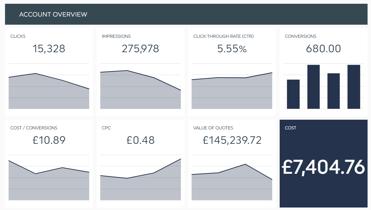
Once the landing page and our strategic work was done, we crafted new copy and got the campaigns live. One of Mike Wye’s other specialisms is wood fibre insulation, so we also revamped and took over the ongoing management of this campaign. Both campaigns have been incredibly successful, generating over £145K worth of quotations from the website since we started in late March.
The Future
Mike Wye came on board as a brand and design client, but the relationship didn’t end when the project finished. We have an active digital advertising retainer that now covers three different campaigns, and we’ve been pleased to work together on multiple adhoc graphic design projects too – both for MW and the core Mike Wye brand.
Their focus on sustainable materials means they’re a perfect partner for Roots in terms of ethos, and we’re excited to offer more support as the business keeps growing.
Have you got a project in mind you’d like a hand with? Whether it’s branding and graphic design or digital advertising, we’re always happy to help. Drop us a message.